This is a side-project — an imaginary box ready to be filled with ideas, influences, and references.The name has no fixed meaning; it’s ever-evolving.
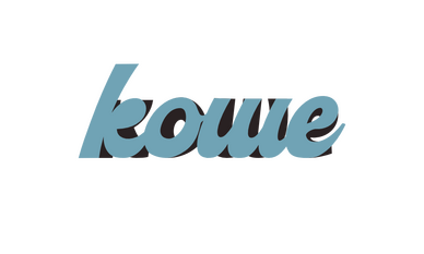
The logo reflects this: it is a simple typography with a shadow, but if you look closely, the shadow is inconsistent with the typeface. Instead, it comes from an older version of the logo, emphasizing that nothing stays static.I’ve translated it into Chinese as “扩文” — expanding culture — referring to the cultural exchange I hope to bring through my designs.
The project borrows from the places I’ve lived, the people I’ve met, the photos I’ve taken, the music I’ve listened to, the movies I’ve watched, and so on. Often it’s about mixing cultural elements, comparing interpretations, or searching for a common perspective.Kowe is not just another indie t-shirt label. It’s a way to build a community around shared interests. It’s indie to its core — no huge factories are involved. No trending locations, pop-ups, or exclusive events, but a simple plus-one code with every limited-press tee — a way for one friend to access and purchase their own t-shirt — allowing the community to grow organically, one connection at a time.Built by friends, not followers.
这是一个副项目:一个等待被填满的想象盒子,装着各种想法、灵感与参考。“Kowe” 这个名字没有固定含义,它在不断发展。
标志也体现了这一点:它是一个带阴影的简洁字体,但仔细观察你会发现阴影的字体并不完全与正文字体一致,而是来自标志的旧版本,强调没有什么是永远固定不变的。我将其翻译为中文 “扩文” — 意为 “扩展文化”,象征我希望通过设计实现的文化交流。这个项目借鉴了我生活过的地方、遇见的人、拍下的照片、听过的音乐、看过的电影等等。它常常尝试将不同文化元素融合,比较不同的理解,或者寻找共同的视角。Kowe 不仅仅是一个独立 T 恤品牌,它是一种围绕共同兴趣建立社区的方式。
它完全保持独立精神 — 没有大工厂参与。每件限量 T 恤都带有一个 Plus One 邀请 — 让一位朋友也能获得购买的机会 —,让社区可以自然成长,一次一次,通过人与人之间的联系。由朋友构建,而非追随者。
KOWE SHANGHAI
2025
© All rights reserved.